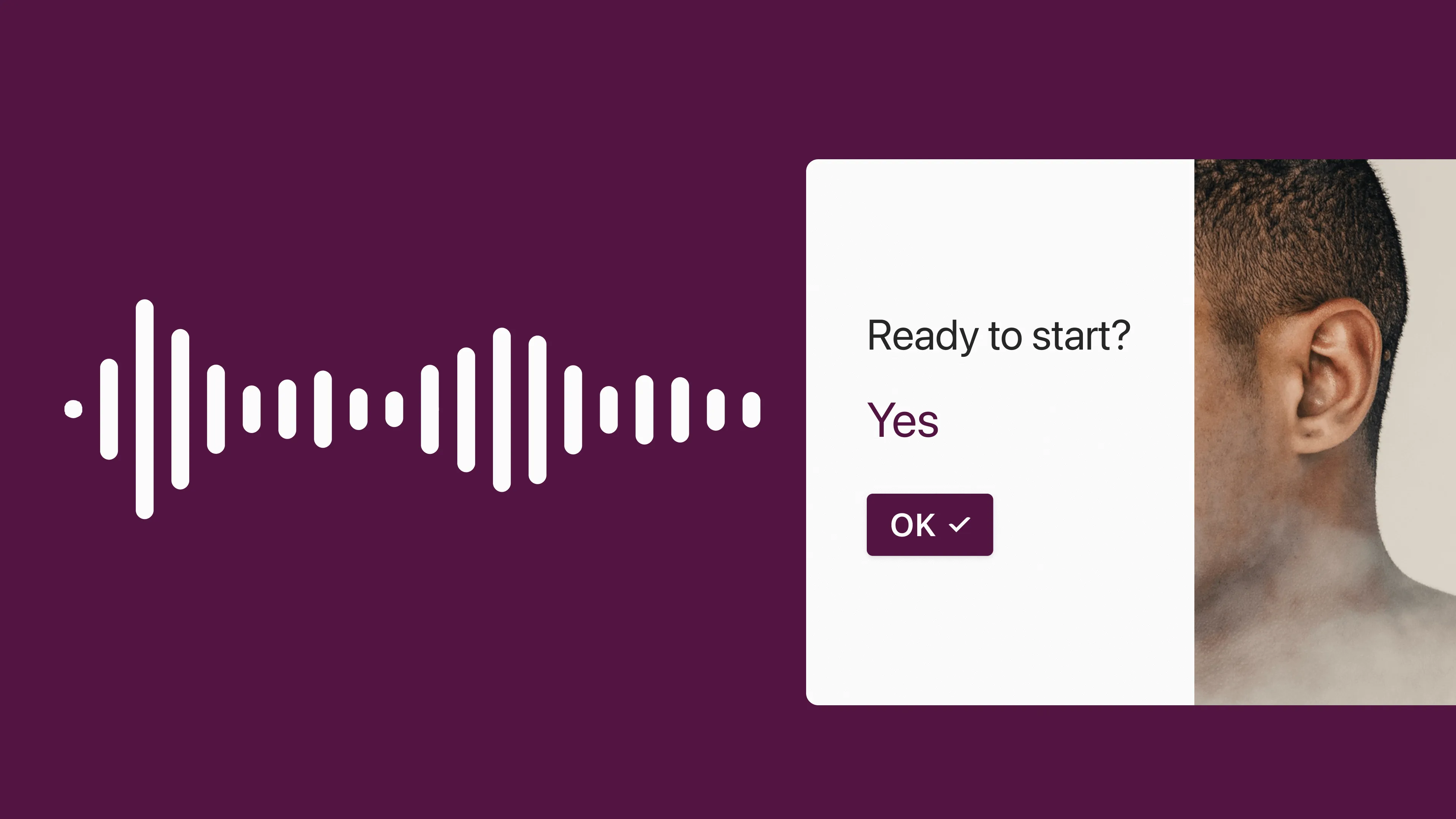
Accessibility and design: How Typeform designed an accessible journey, and why it matters
A step by step guide on becoming more accessible in design from Typeform’s Senior Product Designer, Yuri Martins.
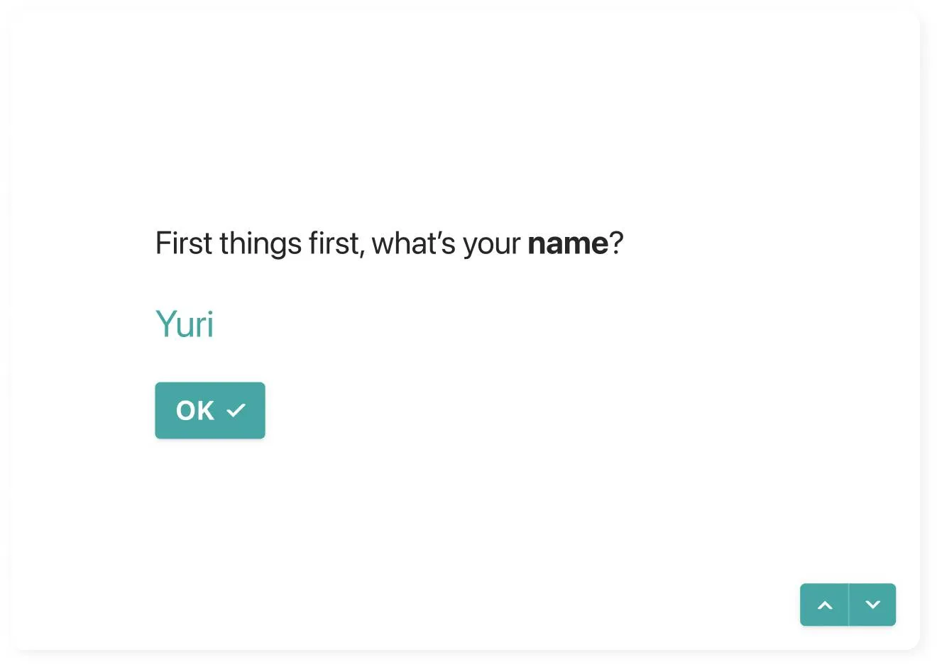
This is the first article I have ever written. I’ll begin then, in the same way as I do many of my presentations: with a disclaimer.
I've been working with accessibility since the beginning of 2020. This is a topic I'm still learning a lot about, every day. For that reason, I’ll be covering some of the most pertinent areas I’ve worked on, but other topics and information might be missing. At Typeform, we’re passionate about ensuring full accessibility. We’ll continue to add more informative details of our journey towards accessibility, and share additional insights as we learn.
Considering design in accessibility
There is no way we can achieve accessibility without the work of our engineers. They are, without a doubt, the people working the hardest to make sure we are accessible. For the sake of simplicity, this article will focus on the design considerations we made in order to have an accessible interface. This will not involve coding skills.
We will go quickly through how we started, and then deeper on the design considerations we took when making typeforms accessible.
First step: Identifying the gaps
In 2019, we started our accessibility initiative at Typeform with a focus on the ‘respondent experience’. The respondent experience, also known as the renderer, is in fact the actual typeform anyone, including you, answers. This is quite different from the ‘creator experience’, in which you are the creator of a typeform.
One of the first actions we took toward this initiative was to hire an external service provider to evaluate the current state of our renderer, or respondent experience. After analysis, we received a report back, in which they classified our renderer in each of WCAG's 2.1 AA requirements. The scores assigned in such cases were: Pass, Needs Improvement, Fail, or Not Applicable. Our scores in each of the assessed areas, some of which we received a fail for, was the starting point for all our work.
Establishing design considerations in accessibility
We put in a lot of work and effort in this past year to improve. Specifically, below are the design considerations we made to ensure an accessible interface. Good news is, these improvements did not involve coding skills.
Color contrast: Getting a shade closer to accessibility
WCAG 2.1 Success Criterion 1.4.3 Contrast
The visual presentation of text and images of text has a contrast ratio of at least 4.5:1 (exceptions can be found on W3's website).
Color contrast was one of the most challenging aspects of making the respondent experience accessible. Because typeforms are highly customizable, trying to make sure any typeform created is accessible would mean many changes to our interface. Changes that could render typeforms unrecognizable as, well, typeforms.
The path we followed was to first study each of our elements individually. This meant we needed to understand the contrast between colors, and take different states into consideration. This helped us identify where color contrast was failing or passing, and to create rules in which we could quickly check to see if there was enough contrast, or not.
As soon as we did this, we understood that our primary color, the default color we were using in our interface, was failing this contrast requirement. We saw this as an opportunity to partner with the brand team, and to come up with a new color that would represent Typeform. And of course, make sure we were accessible.
The outcome: Every time you create a new typeform from scratch now, you have 3 main colors being applied in your design settings—black (#000000), our Majorelle blue (#0445AF) and white (#FFFFFF). The combination between these 3 colors in our interface always has contrast enough to pass the AA requirements for success criterion 1.4.3. To check all contrast ratios, we used a combination of Webaim's contrast checker, and Stark for Figma

Keyboard navigation: Another type of change
WCAG 2.1 Success Criterion 2.1.1 Keyboard
All functionality of the content is operable through a keyboard interface.
Keyboard navigation is one of the most important aspects of web accessibility. When content can be operated through a keyboard, it is operable by people with low, or no vision. These are people who cannot use devices such as mice that require eye-hand coordination. This also applies for people who must use alternative navigation, or people that use a keyboard because of preference or efficiency.
Even though you could navigate through some questions using the keyboard on the renderer experience, this was not true for all our question types. We also didn't have designs for each of the states (default, hover, focus, active, disabled) in each of our question types and components.
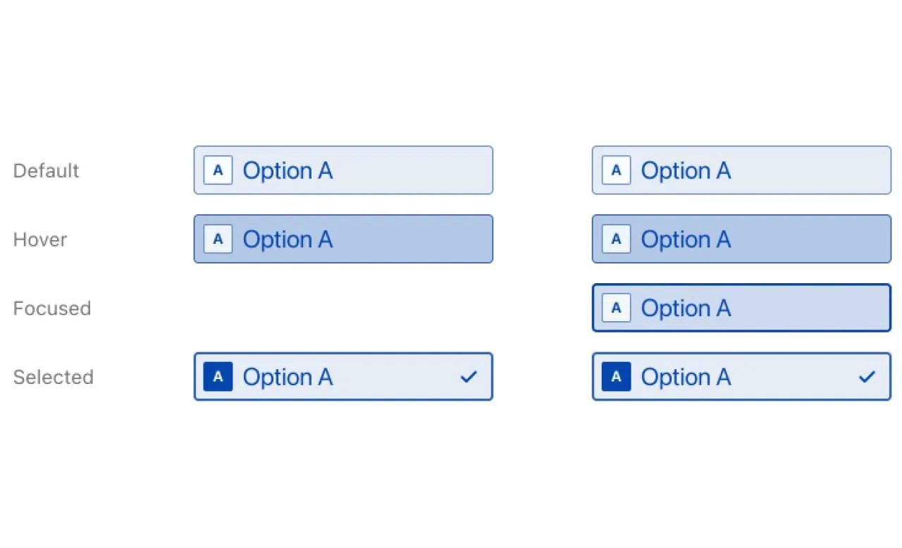
When we started working on these designs, we set out to achieve two goals. The first, was that we didn't want to change the visual interface of the components to fit the new/improved states. We wanted to keep what we had visually, and improve from it. The second was that we needed to make sure that the states were consistent even between different question types (E.g. Short Text, Multiple Choice, and Rating). After some exploration, we found a solution, using a 2 pixel outline in our elements used on focused state.
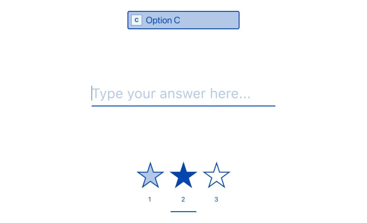
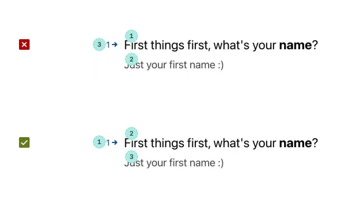
Establishing a meaningful sequence
WCAG 2.1 Success Criterion 1.3.2: Meaningful Sequence
When the sequence in which content is presented affects its meaning, a correct reading sequence can be programmatically determined.
Whenever designers build something that should follow a logical sequence, we need to specify for the team which sequence it is, so that we make sure assistive technology users go through the same flow as anyone else. This is very important for people who rely on assistive technologies that read content aloud, so that the sequence in which the content is being read makes logical sense.
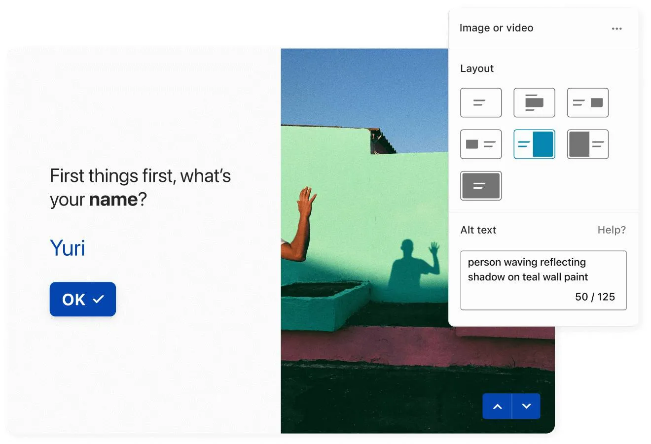
Non-text content
WCAG 2.1 Success Criterion 1.1.1 Non-text Content
All non-text content that is presented to the user has a text alternative that serves the equivalent purpose. Exceptions can be found on W3's website)
To make sure we were meeting this requirement, we had to actually improve the typeform building experience, to provide our customers a place where they could add an alt-text to any image they'd add to their typeforms.
We also wanted to be proactive, and because some of the services we use for images, such as Unsplash, already provide alt-text in their images, we started automatically filling this field in with the alt-text that comes from these services. This still allowed our customers the freedom to edit them, if needed.
Accessibility for pause, stop, hide
WCAG 2.1 Success Criterion 2.2.2 Pause, Stop, Hide
For any moving, blinking or scrolling information that (1) starts automatically, (2) lasts more than five seconds, and (3) is presented in parallel with other content, there is a mechanism for the user to pause, stop, or hide it
Besides partnering with Unsplash for their beautiful images, we also partnered with Pexels to provide delightful videos to be added to typeforms. To make sure we provide an accessible experience to our respondents, whenever we use videos, we need to provide them a way to pause these videos from playing.
Here again, we wanted to make sure the interface remained as simple as possible, while still being accessible. We achieved that by implementing three features to any video or gif element. First, and most important, if the respondent has turned on the reduce-motion feature of their OS, the videos or gifs won't even start to play. They'll be displayed as images only. The second and third are that the user themselves can pause the videos with a mouse, just by clicking on it, or with the keyboard, pressing the escape key.
Prioritizing seizures and physical reactions
WCAG 2.1 Success Criterion 2.3.1 Three Flashes or Below Threshold
Web pages do not contain anything that flashes more than three times in any one-second period, or the flash is below the general flash and red flash thresholds.
As most designers, we love animations and want to keep creating them. The difference is that now, we always make sure our animations are meeting the threshold above, making sure it's safe for everyone to access.
A work in progress
Accessibility took us, and is still taking us a lot of time. We want to make sure we're not only building a compliant experience, but a usable and accessible experience. One of the main reasons is that accessibility was not considered from the beginning, which made us have to go back and change, or amend a lot of what had been done in the past.
We're getting there, but we also want to make sure this does not happen again. That's why currently, our research, design, engineering, and product management teams are working closely to understand how we implement accessibility into Typeform's workflow. This way, it is not only considered as a feature, but rather the foundation to what we always do.


