Social media icons: free downloads and design tips
Looking for free social media icons? Start with this list of easy-to-use websites. Then read on for tips on how to make social media buttons work for you.
We spend over two hours per day on social media. And 90% of this time goes to cat videos on Facebook, and feeling envious of people’s Instagram gym selfies. Or maybe that’s just me?
The upside of all this time wasting—for marketers, not society—is that social media icons are instantly recognizable to most people. Facebook, Twitter, Pinterest, Instagram—you know their logos, what they mean, and what they do if you click them.
But did you know they also play an important part in your marketing strategy?
So let’s start with the best places to find free social media icons. Then we’ll look at some tips and examples for how to best use those social buttons around your website.
Ready?
Top 3 sites to download free social media icons
Good news: it’s easy to customize the look of your social media logos—for free—to fit in with your brand.
We won’t go into the nitty gritty of every single social media icon pack. But here are some of our favorites that are both free and easy to use.
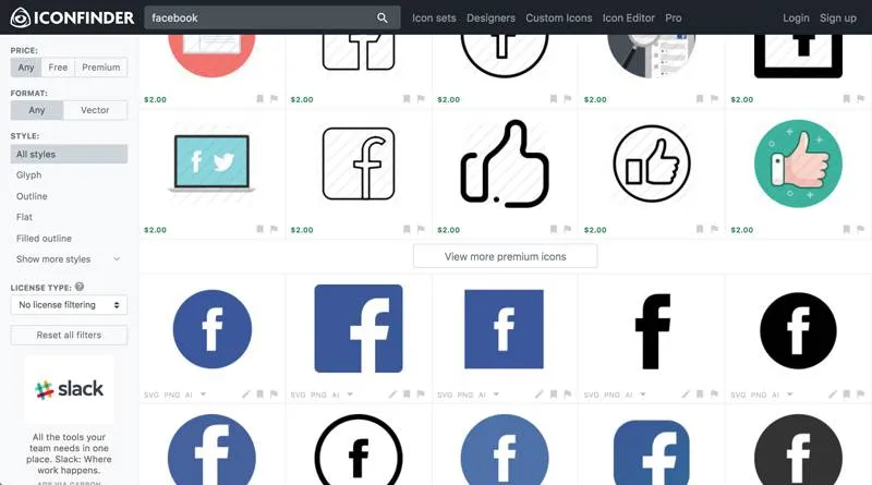
1. Iconfinder
Iconfinder has tons of icons for all kinds of purposes. But most importantly, it has plenty of variations on your standard social media logos.
A quick search for the Facebook logo pulls up icons that are square, round, black, blue, or have a transparent background.
You can also grab Twitter, Pinterest, Google Plus, and Instagram icons in all kinds of formats—and many sets are free.
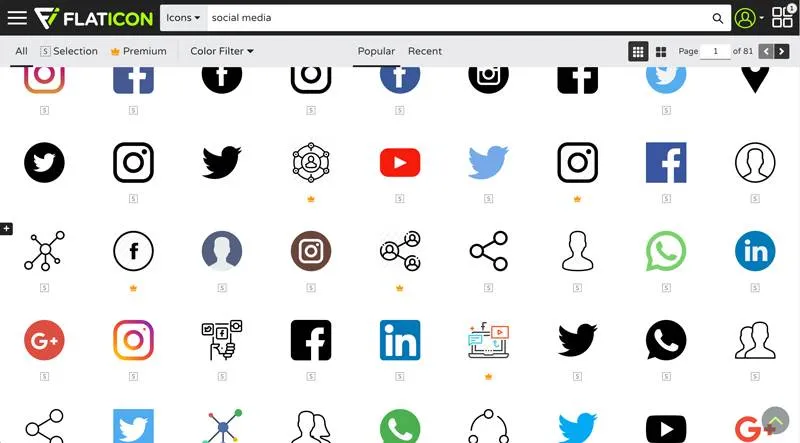
2. Flaticon
Flaticon offers free and premium versions of all the social media icons you need. There’s a wide variety of social media icon packs, plus you can easily filter for color or black and white icons.
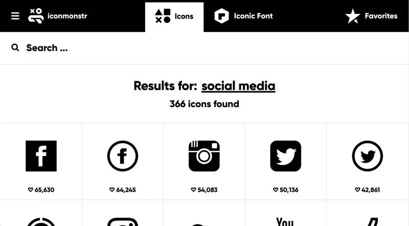
3. Iconmonster
Of the sites mentioned here, Iconmonster comes with the best options for customization and personalization. Pick the color of both the icon and the background, and change the logo size to suit your style.
There are many, many more tools to choose from. But that should get you going in the right direction.
And if you prefer the plugin route, check out WPBeginner’s list of the top 10 plugins for adding social media buttons to your WordPress site.
Now let’s make sure you’re using those social logos how you should be.
Make social sharing easy
Think about the last time you were reading a great article.
“This article sounds smart,” you thought. “I must share it with my social media followers to show how clever I am.”
Then you looked for your preferred social media logo to do just that.
On the article you’re reading now, they’re pretty easy to find in the bar at the bottom of this page—feel free to click one of them. 😉

But have you ever searched for a social media logo and not been able to find it? That’s exactly what you want to avoid on your website.
The design and location of these logos can have a big impact on the success of your social media marketing strategy. So it’s time to put some thought into that big Facebook F, Twitter bird, and Instagram camera.
Where should I put my social media icons?
Short answer: there’s no real consensus on the best place to put your social media icons.
Now that we’ve got that rather unhelpful response out of the way, here’s what we do know.
The parts of pages where social media icons stand out are:
- Floating sidebar
- At the top of an article
- Above the fold
- In the page footer
The golden rule is to make it easy for people to find the icons, because they won’t bother searching for them.
But your social media icons shouldn’t be intrusive either. Don’t let them spoil the design of your website—user experience is everything.
And remember to test, test, test. There’s no objectively right or wrong place to put these icons, so experiment to find out what works best for you.
Let’s look at a couple examples.
TechCruch
When you first click on a TechCrunch article, the social media icons are prominently displayed at the bottom of the screen.

But as you scroll, the bar is collapsed and the logos are hidden, unless you expand it again.
See that hovering green box at the bottom?

TechCrunch prefers readability over intrusive share icons—even if it costs them a few retweets.
Moz
Moz places its “follow me” social media icons at the top right of its blog homepage.
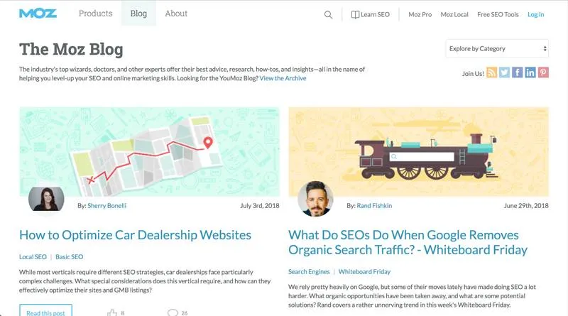
Then on its articles, the social media logos appear on a floating sidebar in the right-hand margin.

They noticed that people interact with different pages in different ways, so they adjusted their social icons to match people’s behavior.
So as you can see, there’s no right answer. Just make sure your icons are easily visible, and tailor their location to the page where they appear.
If you want to experiment, try using a heatmap program like Crazy Egg to see exactly where your users are clicking on your pages.
Remember that social media marketing should be tied to the rest of your marketing efforts. So consider adding social media icons in these other places too:
- Homepage
- Newsletter sign up page
- Email signature
- Business cards
- Email newsletter
- About page
- News articles or press releases
Why should I care how my social media logos look?
Many companies just drop the default social buttons on their website.
But you know the old cliché that a picture is worth a thousand words? Well, when it comes to social media icon design, a little personality is worth a thousand shares.
To stand out and make the most of your marketing real estate, align your social media logos with your brand’s identity. They need to grab a reader’s attention and add something to the site.
For example, in the spirit of their GIF site, Giphy’s animated all their share icons. So when you hover over your favorite social media platform, the icon does a little dance.
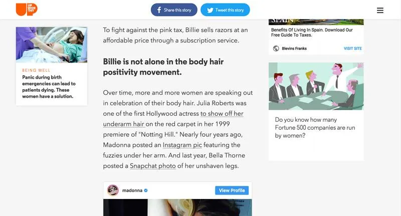
Viral news site Upworthy relies on social shares and word of mouth. So its share buttons are chunky and all over the page—maybe even a bit too much.
There are tons of different icons to choose from. So whatever you decide, make sure it works for your site and brand.
You know your business best
To sum up:
- Add social media buttons to your site: it’s an easy way to drive traffic and build a loyal following.
- Stay true to your brand: your icon design should fit the look and feel of your business.
- Experiment to get it right: there’s no one-size-fits all solution when it comes to social media icon placement and design.
- Put visitors first: make it easy for people to find your share buttons, but don’t disrupt their viewing experience.
And if you still want more social media tips, here’s a few from Barack Obama—the first social media president.


