41 UX survey questions for sharper product insights
41 user experience survey questions organized by category: onboarding, navigation, visual design, and more. True/False format for cleaner, faster data.

Understanding how people actually experience your product is the foundation of good design. You can’t improve what you don’t measure. But asking the right questions—about ease of use, design clarity, feature relevance, and friction points—takes intentionality. A poorly worded question gives you noise instead of insight.
This guide walks through 41 focused user experience survey questions organized by category. Use them as templates to understand how people navigate your product, where they get stuck, and what keeps them coming back.
Why user experience matters
Every $1 invested in UX returns $100 in business value (Forrester, 2025). Every $1 spent on UX research saves $100 in later development costs (Forrester, 2025). On a system used by over 100,000 people, a usability investment of $68,000 generated $6.8 million in benefit within the first year (UXPA, 2025).
These numbers show a simple truth: better user experience improves revenue, reduces waste, and builds loyalty. That’s where user experience survey questions come in.
Let’s take a look at 41 UX survey questions written in True/False format so that your next survey can give you the data you need.
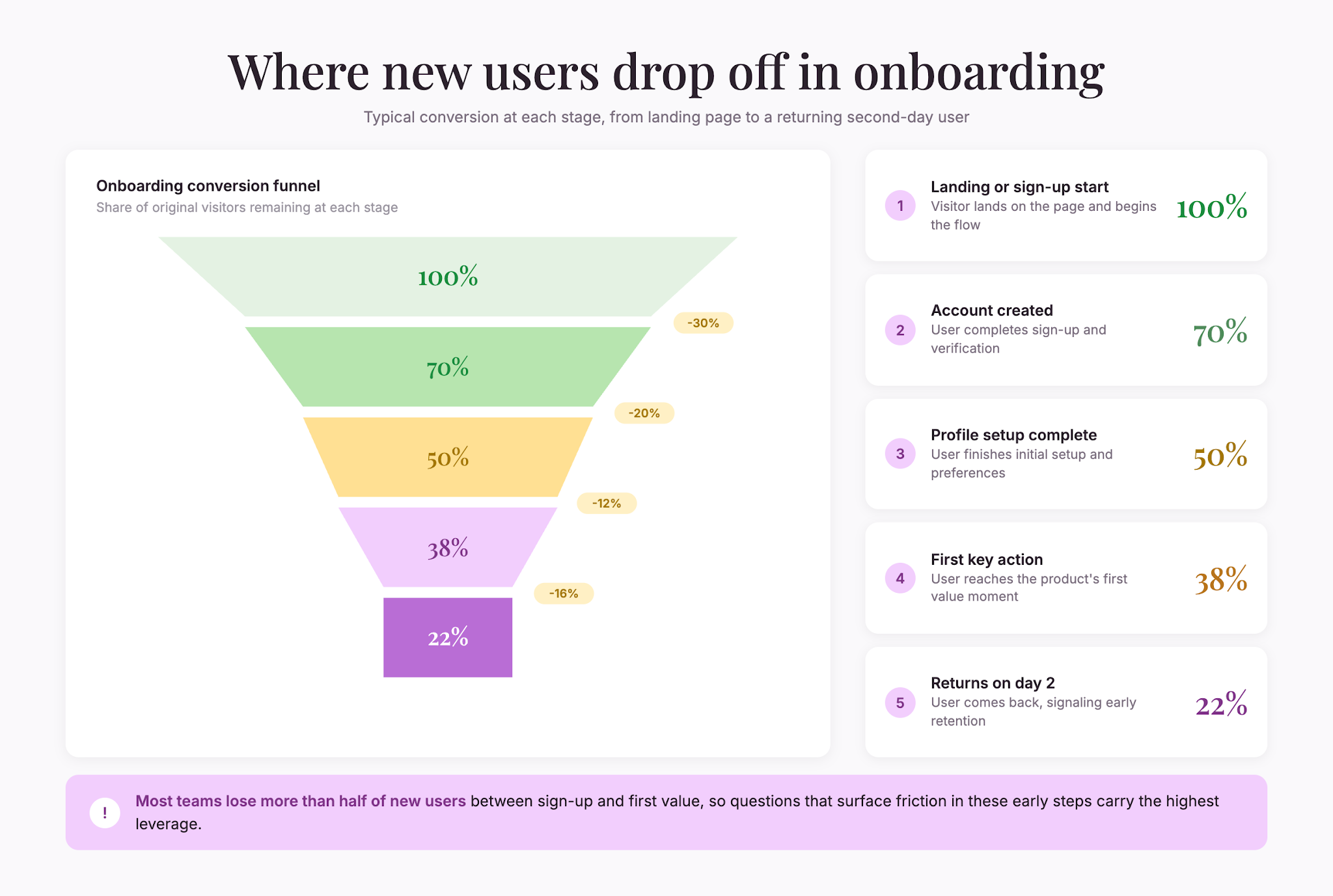
Onboarding and first impression
First impressions shape whether someone becomes a regular user or abandons the product.
- “The sign-up process was easy to complete.”
- “I understood what this product does within the first 5 minutes.”
- “The onboarding tutorial (if present) helped me get started.”
- “I knew what to do next after completing the initial setup.”
- “The interface looked modern and professional.”
- “I encountered technical issues during sign-up or initial setup.”
Ease of use and navigation
Navigability determines whether people can accomplish their goals without frustration.
- “I can find what I need without clicking through multiple menus.”
- “The layout makes sense and is intuitive.”
- “I rarely feel lost or confused about where I am in the product.”
- “The buttons and controls are easy to click and select.”
- “The search function helps me find things quickly.”
- “The menu structure is logical.”
- “Mobile and desktop experiences are equally usable.”
Feature comprehension
If people don’t understand a feature exists or what it does, they won’t use it.
- “I understand what each feature in this product does.”
- “The tooltips and help text explain features clearly.”
- “I discovered features I didn’t know existed by exploring.”
- “The icons and labels clearly communicate their function.”
- “I know how to access the features I need most.”
- “Hidden or advanced features are discoverable when needed.”
Task completion and workflow
Can people accomplish their goals efficiently?
- “I can complete my main tasks efficiently.”
- “I rarely have to switch between this product and other tools to finish my work.”
- “The workflow matches how I naturally think about this process.”
- “I waste minimal time on repetitive steps or unnecessary clicks.”
- “Advanced users and beginners can both accomplish their goals.”
- “Undo/redo and error recovery options help when I make mistakes.”
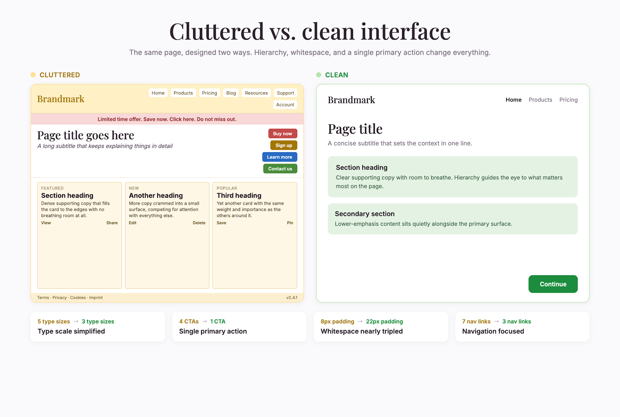
Visual design and aesthetics
Visual design influences both perception of quality and usability.
- “The color scheme and typography are easy on the eyes.”
- “Visual hierarchy makes it clear what’s most important on each page.”
- “The design feels consistent throughout the product.”
- “There’s appropriate white space—the interface doesn’t feel cluttered.”
- “Charts, graphs, and data visualizations are clear and helpful.”
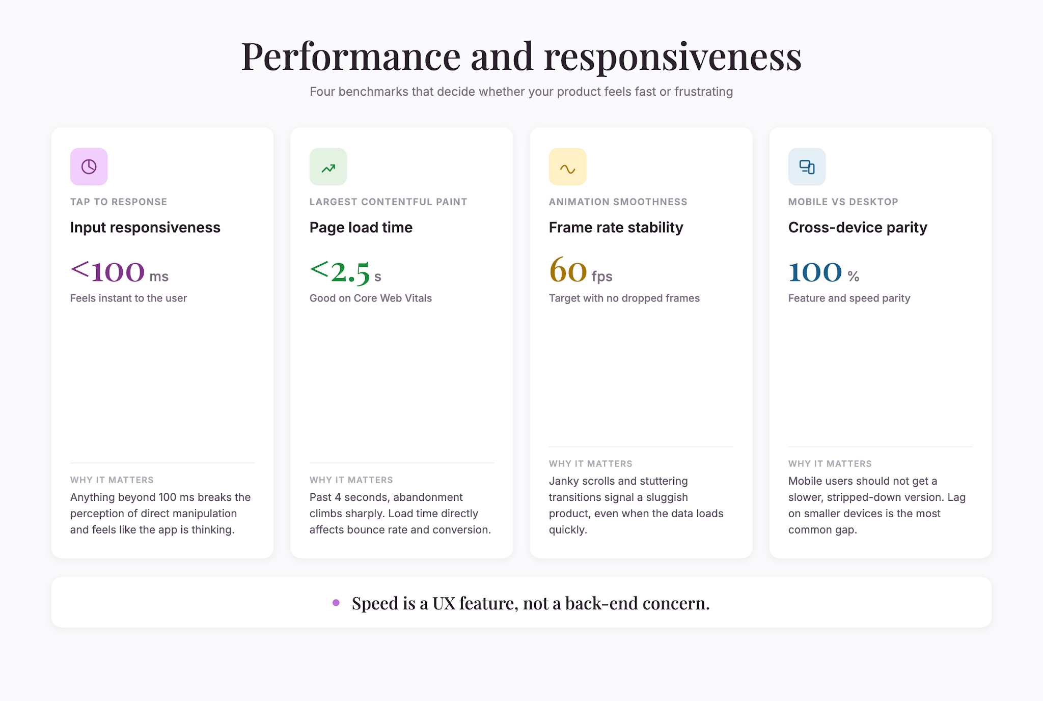
Performance and responsiveness
Slow products frustrate people. Speed matters.
- “The product responds quickly to my actions.”
- “Load times are acceptable.”
- “I don’t experience lag or freezing when performing common tasks.”
- “The product works smoothly on my device and internet connection.”
Accessibility and inclusivity
A product that only works for some users is incomplete.
- “The product is usable with keyboard navigation only (without a mouse).”
- “Text is readable and contrast is sufficient.”
- “The product works with screen readers or assistive technology.”
- “Font sizes and interactive elements are large enough to use comfortably.”
Support and help resources
When users get stuck, good help resources turn frustration into progress.
- “Help documentation is easy to find and clearly written.”
- “I can reach customer support when I need it.”
- “Tutorial videos or guides help me learn features faster.”
Design principles for effective UX surveys
Keep surveys short. Long surveys suffer from higher dropout and lower answer quality. Aim for 5–10 questions. These 41 examples are a library—choose the ones most relevant to your focus.
Use Likert scales for opinions. Questions 1–5 and 7–42 are best answered on a 5-point agreement scale (Strongly Disagree to Strongly Agree). Likert scales produce comparable data quickly.
Add one open-ended follow-up. After Likert questions, ask “What’s the biggest frustration you encounter?” Open-ended responses reveal why people feel the way they do.
Avoid yes-no for nuance. Binary questions oversimplify experience. “Is this easy to use?” has less value than “This product is easy to use” rated on a scale.
Test on mobile. Mobile testing is standard practice. Survey mobile users separately or ask explicitly about mobile experience.
Ask about specific workflows. Generic questions yield vague answers. Ask about specific tasks: “The checkout process is straightforward,” or “I can set up automation without code.”
Watch for response bias. People tend to be agreeable in surveys. Frame questions neutrally and test suggestions, not confirmations.
Consider timing. Survey users shortly after key moments—right after onboarding, completing a major task, or encountering an error. Fresh experience produces more accurate feedback.
Segmenting results for deeper insight
Different user types have different experiences. Always segment your results by:
- User type: New users versus power users
- Use case: A marketer’s experience differs from a developer’s
- Device: Mobile and desktop have different friction points
- Frequency: Daily users and occasional users have different pain points
When you segment, patterns emerge. Maybe the product is intuitive for frequent users but confusing for new ones, or works great on desktop but has broken mobile navigation.
From feedback to action
Collecting feedback is only half the job. Here’s how to act on it:
- Identify themes. Look for patterns in open-ended responses. Repeated friction points are signals.
- Calculate agreement percentages. Aim for 80%+ agreement on ease of use and feature clarity.
- Compare across segments. If new users rate onboarding as 3/5 while power users rate it 5/5, onboarding needs work.
- Prioritize fixes. Focus on high-friction, high-impact issues first.
- Iterate. Run the survey again after making changes to confirm improvements.
Final takeaway
Good user experience doesn’t happen by accident. It comes from listening to people and iterating based on feedback. These 41 questions are a framework for that listening. Choose the ones that matter for your product, keep surveys short and regular, and close the loop by acting on feedback.
That’s how you build products people genuinely enjoy using.
Liked that? Check these out:
.webp)

Product
Typeform vs Google Form: Which Should You Choose in 2025?
Debating which form builder is better suited to your needs? This article provides a detailed comparison to help you compare Typeform with Google Forms, giving you an in-depth view of how Typeform stacks up against Google Forms so you can decide for yourself.
Read more