Usability testing questions: 30+ examples
Thirty usability testing questions grouped by purpose, with neutral follow-ups that reveal where people struggle and what to fix in your product next.
Key takeaways
- Match question type to what you need to learn: Yes/no questions work for quick screening. Open-ended follow-ups reveal the why behind a struggle or hesitation.
- Avoid leading and two-part questions: "Wasn't that intuitive?" nudges people toward an answer. "Did you find it, and was it useful?" forces a muddled response to 2 separate ideas.
- Pair questions with observation: What someone says about completing a task may differ from what actually happened.
- Some forms deserve a closer look: In our data, forms collecting information for a follow-up had a 54.77% completion rate, compared with 72.70% for account setup and management forms. Usability testing can show where people struggle.
- Start small and test again after making changes: Your sample size should reflect your research goal and the different people who use your product.
Usability testing uncovers how real people interact with your product, website, or app. But asking the wrong questions, or asking the right ones in the wrong way, wastes everyone's time and produces unreliable feedback.
The most useful questions connect feedback to a specific experience, like finding a price, completing a form, or recovering from an error. This guide gives you 30 questions organized by purpose, plus opening and wrap-up questions and practical advice for using the answers.
Why usability testing questions matter
A question might seem simple on the surface. But the way you phrase it shapes how people answer. If your question is ambiguous, respondents guess. If it's leading, they tell you what they think you want to hear instead of what they actually think. If it's too broad, you get vague answers that don't help.
Well-crafted usability testing questions do 3 things: they're clear, they're specific, and they capture what you actually need to know to improve your product.
Questions work best alongside a realistic task. A participant might describe a sign-up form as “easy” even after missing a required field twice. Observing that struggle gives you a problem to investigate, and a follow-up question helps explain it.
Before you ask: give participants a realistic task
Start with a learning goal, like “Can a new customer book a demo without help?” Then write a task that describes the outcome without revealing the steps.
Instead of: “Click Contact sales and fill out the demo form.”
Try: “You’re considering this product for your team and want to see it in action. Show me how you’d arrange that.”
This follows GOV.UK’s guidance on moderated usability testing: tasks should be believable, have a clear goal, and avoid giving away the answer.
Decide what counts as success before the session. For a demo request, that might mean submitting the form and recognizing that the request went through. Record whether participants succeed independently, need help, or stop before finishing.
Test these forms closely. In our data, forms collecting information for a follow-up had a 54.77% completion rate across 119.6 million form starts, compared with 72.70% across 30.4 million starts for account setup and management forms. Completion rates show how many people finish; usability testing can help explain where people struggle and why.
A few opening questions can help you understand their experience:
- “When did you last do something like this?”
- “How do you usually handle this task?”
- “Which device would you normally use for this?”
Explain that you’re testing the product and invite them to share their thoughts as they go.
Types of usability testing questions
Use these questions as a menu. Choose the ones that match your learning goal, and ask task-specific questions immediately after the relevant activity.
Task completion and success
These questions measure whether people can accomplish what you want them to do. They're straightforward and outcome-focused.
- Were you able to complete the task? Compare the answer with the outcome you observed.
- How would you rate the ease of completing this task? Use a consistent scale, like 1 = very difficult and 7 = very easy. This format is called the Single Ease Question (SEQ). Using the same wording after each task helps you compare results consistently.
- What, if anything, made this task difficult? Identifies friction without assuming there was a problem.
- Did you need to ask for help to finish? Follow up on when help became necessary.
- How did the time needed compare with what you expected? Explores perceived effort; measure actual time separately if you need it.
Keep perceived ease and observed success separate. Someone can finish a task but find it exhausting, or feel confident despite missing a critical step. Both findings matter.
Navigation and findability
Can people find what they're looking for, and do they understand where they are in your product?
- Were you able to find [X feature/section]? Check their answer against where they ended up.
- What did you try first when looking for [feature/section]? Reveals their starting point.
- What does this menu label mean to you? Tests whether your terminology matches their understanding.
- Where would you expect to find [feature]? Ask before they explore the relevant navigation.
- Where, if anywhere, were you unsure what to do next? Pinpoints moments of uncertainty.
Watch for wrong turns, repeated searches, and backtracking. A participant who eventually finds something may still have encountered a navigation problem.
Design clarity and comprehension
These questions test whether people understand what they're looking at.
- What do you think this page is for? Tests whether your value proposition is clear.
- What would you click on next? Ask in the context of a specific goal.
- Can you describe the main purpose of this section in your own words? Confirms comprehension.
- What, if anything, is unclear on this page? Invites feedback without presuming confusion.
- What information on this page helped you decide what to do next? Reveals which content supports action.
Ask first-impression questions before explaining the page. Once you’ve told someone what a feature does, you can’t assess whether they would have understood it on their own.
User confidence and emotion
Completing a task doesn’t tell you how someone felt along the way. These questions help uncover uncertainty and frustration.
- How confident do you feel using this feature? Use a labeled scale, like 1 = not at all confident and 5 = very confident.
- At what point, if any, were you unsure whether you were doing the right thing? Locates uncertainty within the task.
- Would you use this again? Captures stated intent, not actual behavior. Follow up with “Why or why not?”
- What could make you feel more confident using this? Gives you actionable feedback on trust-building.
- What, if anything, frustrated you during this task? Connects emotions to a specific experience.
Treat stated intentions cautiously. Saying “I’d use this again” doesn’t establish that someone will return. Ask about their current behavior and what would need to improve.
Preference and comparison
When you're deciding between design options, these questions help you choose.
- Which version, if either, felt easier to use? Allow participants to report no difference.
- What influenced your preference? Explores the reason behind their choice.
- What would make this feel more natural to you? Invites improvement ideas.
- What felt familiar or unfamiliar about each version? Helps you recognize the influence of prior experience.
- Which layout, if either, made [specific information] easier to find? Connects the comparison to a concrete goal.
Give participants comparable tasks in both versions, varying which version they see first. Compare their preferences with observed task success: a design can look more appealing while being harder to use.
System feedback and messaging
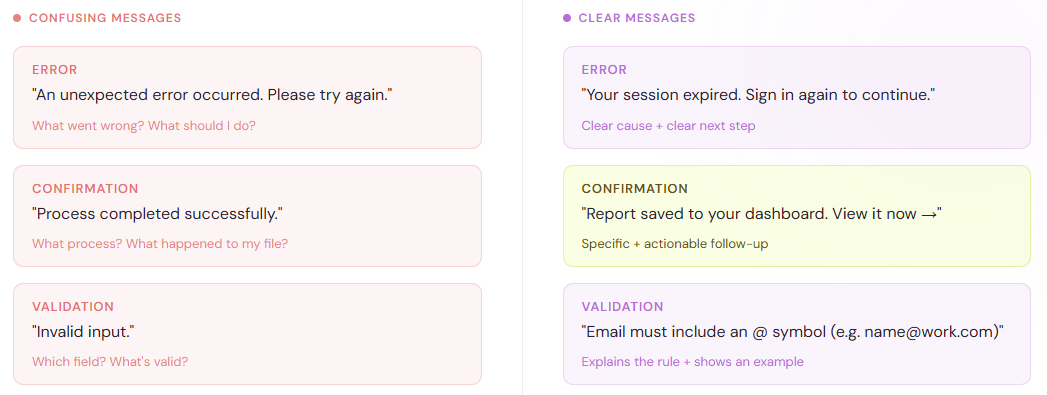
Does your product communicate clearly when something happens?
- In your own words, what does this confirmation message tell you? Checks understanding beyond a yes/no answer.
- What would you do next after seeing this error message? Tests whether the message supports recovery.
- What do you think happened when you clicked that button? Reveals whether feedback was clear.
- What, if anything, changed on the screen after you [performed action]? Checks whether participants noticed the feedback.
- What information, if any, is missing from the message? Reveals what people need to proceed.
For a form, pay attention to what happens after submission. Do participants recognize that they’re finished? Do they understand whether to expect an email, a booking confirmation, or another step?
Wrap-up questions
Leave a few minutes after the final task for participants to reflect on their experience and share anything you haven’t covered.
- Which part, if any, did you find most difficult? Highlights the challenge that stood out to them, which could be different from what you observed.
- If you could change one thing, what would it be? Helps you understand their top priority.
- How would you describe this product to a colleague? Shows how they understand its purpose in their own words.
- What, if anything, surprised you? Reveals where the experience differed from their expectations.
- Is there anything else you’d like to share? Gives them space to raise something your questions missed.
Save these broader questions for the end so they don’t influence how participants approach later tasks.
How to write better usability testing questions
Avoid yes/no questions when you need detail
Yes/no questions work when you need a simple distinction. But they won’t explain what made a task easy or difficult. Use a rating to capture perceived ease, then an open-ended question when you need context.
Instead of: "Was this easy?"
Try: “How would you rate the ease of this task?” followed by “What influenced your rating?”
Leave room for open-ended feedback. In our data, forms with a long-text question had a 57.90% completion rate, similar to the 57.21% for forms with a yes/no question. These figures describe whole forms, so they don’t show how either question type affects completion. Use an open-ended follow-up when understanding someone’s answer will help you decide what to improve.
Ask one thing at a time
A question like "Did you find the feature, and was it useful?" packs 2 ideas together. The person may find it easily but not find it useful, or vice versa. They're forced to give a muddled answer.
Instead of: "Did you find the menu clear and helpful?"
Try: "Were you able to find what you needed in the menu?" and, separately, "How helpful was the information you found?"
Use plain language
Avoid jargon, acronyms (unless your participants live and breathe them), and corporate speak. If someone on your team would never say it out loud in conversation, reword it.
Instead of: "Did the user interface facilitate effective task completion?"
Try: "How did that task go for you?"
Make questions specific, not vague
"What did you think?" is too broad. The person won't know what aspect to focus on: the design, the speed, the content, or all of it.
Instead of: “What did you think of the form?”
Try: "What did you expect to happen after selecting Submit?"
Don't ask leading questions
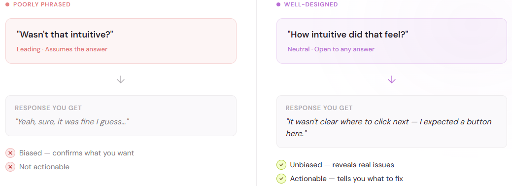
A leading question nudges the respondent toward an answer you want. This biases your results and defeats the purpose of usability testing.
Instead of: "Wasn't that intuitive?"
Try: “How did you decide what to do next?”
Even “What made this difficult?” assumes difficulty. Unless the participant has already described a problem, add “if anything” or ask them to explain their experience in their own words.
Follow up where you need more context
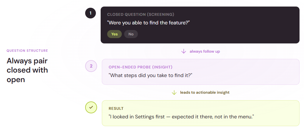
A yes/no answer or a rating doesn't tell you why.
You don’t need an open-ended follow-up after every closed question. Use one when the answer will help you understand a behavior, explain a rating, or make a decision.
Useful prompts include:
- “What makes you say that?”
- “What were you expecting to happen?”
- “Can you tell me more about that step?”
How many participants do you need?
The number of people you test with depends on your goal. If you're running qualitative usability testing to uncover themes and patterns, you don't need hundreds of people.
For a focused qualitative round, 5 participants is a common starting point. Nielsen Norman Group’s sample size guidance distinguishes these small studies from quantitative research and recommends accounting for substantially different user groups.
Use that starting point to plan an initial round, make improvements, and test again. It isn’t a guarantee that you'll uncover every important problem. If customers and administrators use different workflows, recruit people for each. Include relevant devices, experience levels, and accessibility needs in your recruitment plan.
If your goal is to estimate a completion rate or demonstrate a measurable difference between designs, plan a quantitative study with a sample size suited to that question. A small qualitative round won’t support population-level claims.
Compare your live form’s completion rate with forms that serve a similar purpose. In our data, support request forms had a 56.55% completion rate, and order and payment forms had a 58.95% completion rate. Application forms had a 45.97% completion rate across 143 million starts.
Timing and pacing
Don't ask all 30 questions in one session.
Build the session around the tasks you need to observe. Leave space for instructions, follow-ups, and a short wrap-up, then pilot the session to check whether it fits the time available.
During a task, give participants room to work through uncertainty. Frequent questions can interrupt their flow or steer their behavior. Note moments you want to revisit and ask about them at a natural pause or immediately after the task.
Test your questions on a colleague or friend first. If they seem confused, reword.
For an unmoderated test, clear written instructions matter even more because you won’t be there to clarify them. Pilot the complete experience, including task links and follow-up questions.
Collect consistent follow-up feedback with Typeform
A short questionnaire can help you collect the same core feedback after each task or session. Adapt our product testing survey template to include a task identifier, an ease rating, and an open-ended follow-up. Keep the wording and scale consistent when you want to compare responses.
Closed questions help you compare responses across sessions. Multiple choice was the most common question type in our dataset, appearing in forms that accounted for 703 million starts.
To assess overall usability after a session, consider the System Usability Scale (SUS). Participants rate 10 standard statements on a 5-point agreement scale. Their responses are converted into a score from 0 to 100, which you can compare across testing rounds.
Use branching logic to show relevant follow-ups. For example, someone who reports being unable to finish can receive “What prevented you from completing the task?”
Review those responses alongside your observation notes. A feedback questionnaire captures what participants report; it doesn’t, by itself, verify whether they completed the task successfully.
Turn findings into practical improvements
After the sessions, group findings by task and problem. For each issue, record:
- What happened: the behavior you observed.
- Where it happened: the page, field, or step involved.
- Its impact: whether it blocked completion, caused an error, or created hesitation.
- Supporting evidence: participant comments and the number of people who encountered it in this round.
- The next step: a change to test or a question that needs further research.
For example: “3 of 5 participants tried to submit without choosing a time zone. The error appeared above the visible area, so they didn’t know how to continue.” That finding gives your team a specific problem to address.
Prioritize problems that block important tasks or cause consequential mistakes, even if only one participant encounters them. Test the revised experience to see whether the change resolves the issue.
Clear questions help you understand an experience. Pair them with observed behavior and a concrete next step, and your usability test becomes a practical guide to what to improve.
Source: Typeform internal data from 882,461,930 form starts across approximately 2.4 million forms, September 2025 to August 2026. Completion rate is calculated by dividing submissions by form starts.