Landing page builder that turns clicks into conversions
Stop sending traffic to your homepage. A landing page builder gives you focused, distraction-free pages designed to convert, in minutes, not weeks.
Share
Latest posts on
Free Online Trivia Maker: Create Custom Trivia Quizzes in Minutes
|
May 18, 2026
Read more
AI survey builder: create smart surveys in minutes with Typeform AI
|
May 18, 2026
Read more
Best test maker: build assessments people trust
Typeform
|
April 22, 2026
Read more
Online form builder for any workflow or team
Typeform
|
April 22, 2026
Read more
Share
The ultimate guide for a landing page builder
What if you could test a new idea before building the product? What if you could measure demand for a service in an afternoon, instead of a quarter?
That's what a landing page does. It's a single web page with a single purpose—and it's one of the most efficient tools in marketing.
A landing page builder lets you create these focused pages without a developer, a designer, or even a content management system. Simply drag, drop, publish, and start learning what your audience actually wants.
What makes a landing page different from a website?
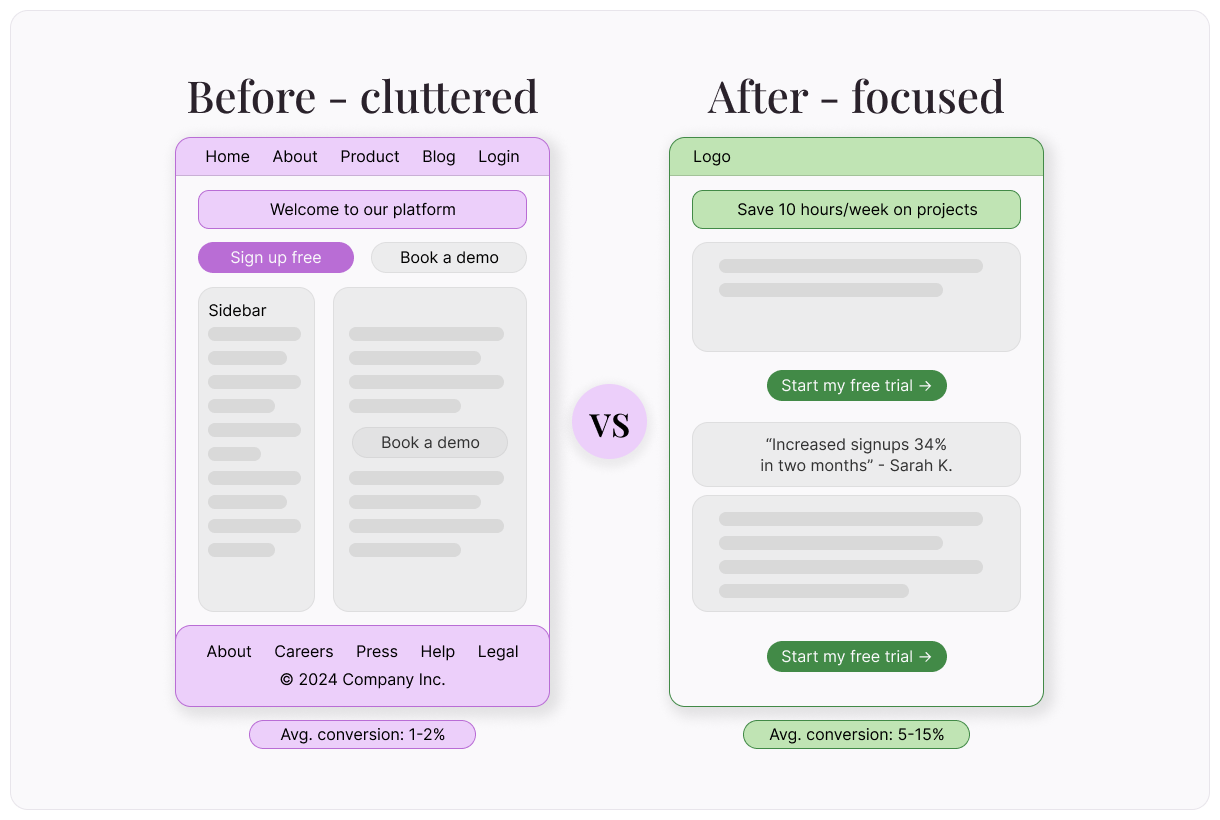
Your website is a house. It has rooms, hallways, and plenty of places to wander. A landing page is a doorway. It leads to one room with one purpose. That distinction matters.
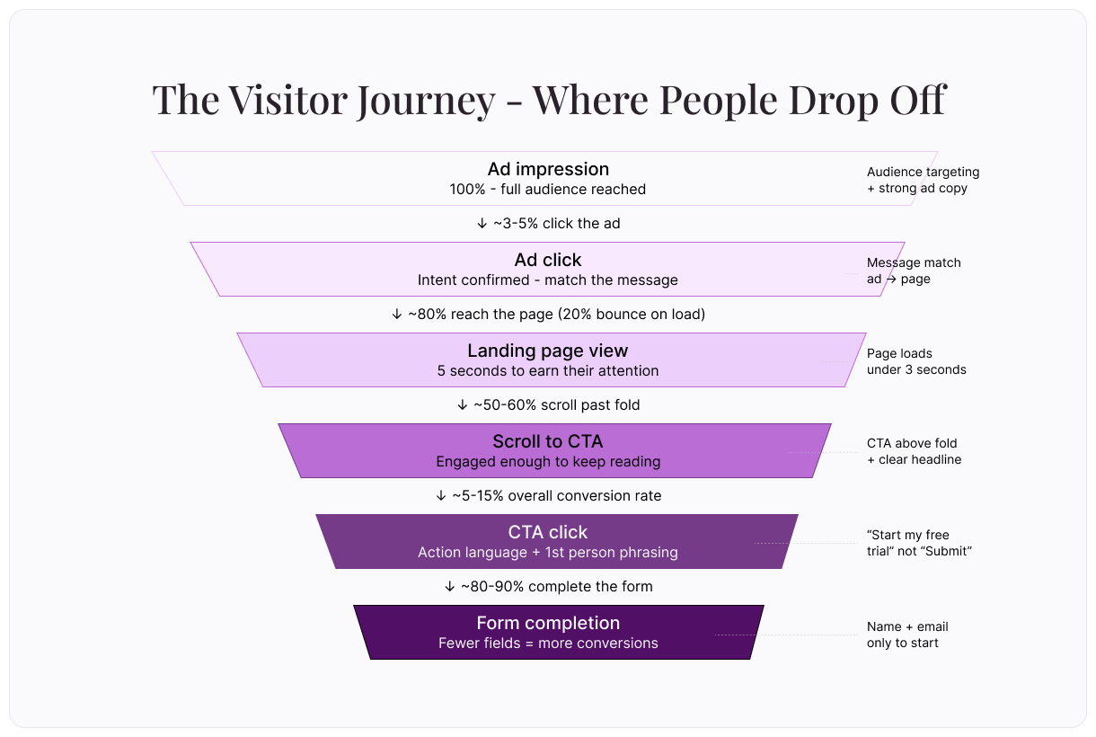
A homepage serves browsers—people exploring, comparing, clicking around. A landing page serves people who've already clicked—on an ad, a social post, an email link. They showed up with intent, and the landing page exists to match that intent with a clear next step.
There’s no navigation menu, no sidebar, and no competing calls to action. Just a headline, a value proposition, and a single ask: sign up, download, register, or buy.
The anatomy of a high-converting landing page
Every effective landing page shares a handful of structural elements. Understanding each one—and why it works—is the difference between creating a page that converts and one that collects dust.
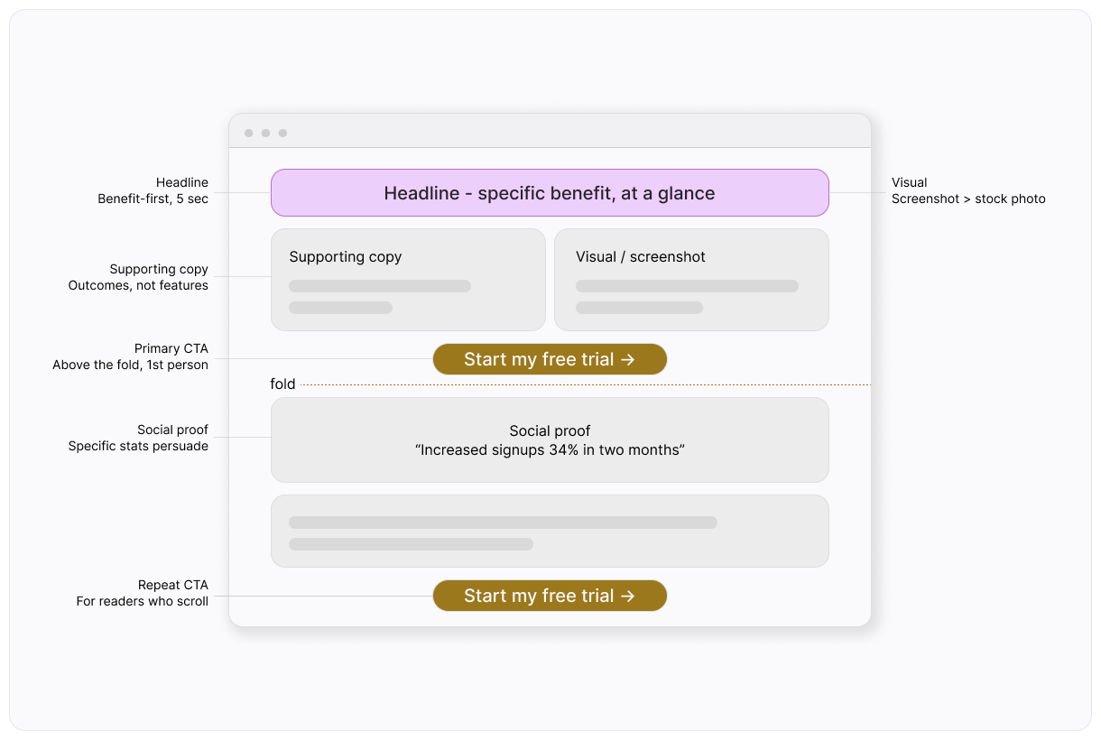
Headline
You have about five seconds before someone decides to stay on your landing page or leave. So your headline needs to communicate the core benefit immediately. Not what you do, but what the visitor gets.
"Save 10 hours a week on project management" works. "Our project management platform" doesn't.
The strongest headlines are specific, benefit-driven, and short enough to read at a glance.
Supporting copy
Formatted as one or two short paragraphs (or a few bullet points) that expand on the headline, your supporting copy answers the visitor's next question: "How?"
Keep it focused on outcomes, not features. Your goal should be benefits first, details second. If your headline promises a result, the supporting copy should explain how you deliver it.
Visual element
This can be a hero image, a short video, or a product screenshot that reinforces your message. People process visuals faster than text, so make sure yours adds clarity rather than decoration. A screenshot of the actual product in use is almost always more effective than a stock photo.
Social proof
This might include testimonials, customer logos, review scores, or case study snippets. When someone's deciding whether to trust you, seeing that other people already do is powerful. Even a single well-placed quote can tip the balance.
And, the more specific the proof ("We increased signups by 34% in two months"), the more persuasive it is.
Call to action (CTA)
The single most important element on the page is your call to action (or CTA) button. This button should be visually obvious and use action-oriented language ("Start my free trial" instead of "Submit"). It should also appear at least twice: once above the fold (i.e. before the user has to scroll) and once at the bottom of the page.
Finally, remember that language matters: First-person phrasing ("Get my free guide") tends to outperform third-person ("Get your free guide").
How to build a landing page that converts
So, how do you combine the elements above to create a conversion-ready landing page?
Step 1: Define your conversion goal
Every landing page needs exactly one goal. Trying to get email signups AND product demos AND newsletter subscribers on the same page splits attention and kills conversion rates. Pick one action and design everything around it. If you have multiple goals, build multiple pages.
Step 2: Match your message to the source
If someone clicked an ad about "free project templates," your landing page should feature free project templates—not your company's entire product line. Message match (the alignment between ad copy and landing page copy) is one of the strongest predictors of conversion. When visitors see the same language they just clicked on, it confirms they're in the right place.
Step 3: Write for skimmers
Most visitors won't read every word. They'll scan the headline, glance at subheadings, and look at the CTA. Structure your page so that someone skimming still gets the core message. Use short paragraphs, bullet points, and bold text to guide the eye. If your key value proposition is buried in paragraph three, most visitors will never see it.
Step 4: Remove distractions
Every link that isn't your CTA is a potential exit. Remove navigation bars, footer links, and sidebar widgets. The only clickable elements should be your CTA and any essential legal links (privacy policy, terms).
Remember: The landing page has one job. Let it do that job.
Step 5: Test and iterate
Publish your page, drive traffic to it, and watch what happens. Most landing page builders include A/B testing—the ability to run two versions simultaneously and see which converts better. To ensure clear results, only test one variable at a time: headline, CTA text, hero image, or form length. Small changes can produce surprising results.
Landing page use cases
Landing pages work for nearly any goal where you need a focused, distraction-free experience. Here are some of the most impactful use cases:
Product launches – Build anticipation with a pre-launch page that collects email addresses. When you're ready to launch, you've already got an audience waiting. Include a countdown timer if you have a firm launch date.
Event registration – Create a single page with event details, speaker highlights, and a registration form. No distractions, just signups. The best event landing pages include a photo or video from a previous event to set expectations.
Free resources – Offer a free resource (ebook, template, checklist, toolkit) in exchange for an email address. The landing page sells the resource; the resource sells your expertise. Just make sure to be specific about what's inside—"47-page guide with 12 templates" outperforms "free ebook."
App downloads – Direct mobile users to a clean page with app store links, screenshots, and a few key benefits. Skip the full website and reduce the steps to download.
Seasonal campaigns – Create landing pages for Black Friday deals, holiday promotions, or back-to-school offers. Each campaign gets its own page with tailored messaging and a clear deadline. When the campaign ends, update or archive the page.
Webinar signups – For this use case, place date, time, topic, and speaker bios above the fold, with a registration form right beside them. Include a "Can't make it? Register to get the recording" option to capture more signups.
What to look for in a landing page builder
Now that you know howto create an effective landing page, you need a high-quality landing page builder to put that knowledge to use. Here’s what to look for:
Templates
Good templates aren't just pretty—they're conversion-tested. Look for a builder with templates organized by goal (email collection, event registration, product launch), so you're starting from a proven structure rather than a blank canvas.
Speed
Page load time directly affects conversion. If your page takes more than three seconds to load, you'll lose visitors before they even see your headline. Choose a builder that produces fast, lightweight pages and doesn't add unnecessary bloat.
Analytics
At a minimum, you need to track page views, conversion rate, and traffic sources. Built-in analytics save you from configuring third-party tools for these basic metrics. Look for heatmap integrations too—they show where visitors click and how far they scroll.
A/B testing
Testing is how good landing pages become great ones. The ability to split traffic between two versions and measure the difference is essential. Look for tools that make it easy to duplicate a page, change one element, and compare results.
Custom domains
Publishing your landing page on your own domain (yourcompany.com/offer) looks more professional and builds more trust than a generic builder subdomain. It also helps with brand consistency and search engine optimization (SEO).
Five tips to improve your landing pages
1. Put your CTA above the fold
Visitors shouldn't have to scroll to find the action you want them to take. Make sure your primary CTA is visible the moment the page loads. Then, repeat it further down for visitors who want to read more before committing.
2. Use specific numbers
"Join 14,327 marketers" is more persuasive than "Join thousands of marketers." Specificity builds credibility because it implies real data rather than vague claims. The same principle applies to results: "Saves you three hours per week" beats "Saves you time."
3. Reduce form fields
Every additional form field you have reduces conversions. For most purposes, name and email are enough to start. You can always ask for more information later, once you've earned their trust. If you absolutely need more fields, explain why (for example, "We'll use your role to send you relevant resources").
4. Create urgency (honestly)
"Registration closes Friday, March 20," works because it's real. "Limited time offer!" with no actual deadline feels manipulative. Use genuine deadlines and real scarcity—don't manufacture them. People can tell the difference.
5. Speed-test your page
Run your published page through a speed testing tool. Compress images, minimize scripts, and choose a builder that prioritizes performance. Why?
A site that loads in 1 second has a conversion rate 3x higher than a site that loads in 5 seconds, so testing speed is crucial. On mobile, where connections can be slower, speed is even more critical.
Your next page is your next experiment
Landing pages aren't just marketing assets—they're experiments. Each one tests a hypothesis: Does this message resonate? Does this audience want this offer? Is this the right price?
The faster you can build and launch pages, the faster you can learn. And with today's landing page builders, "fast" means minutes, not weeks. Get started now, and get the data you need sooner.
Free Online Trivia Maker: Create Custom Trivia Quizzes in Minutes
Trivia is engaging. People love testing their knowledge, competing with friends, and proving they know random facts nobody asked them to memorize. That’s why trivia works as a learning tool, a marketing hook, an event activity, and just plain fun.
AI survey builder: create smart surveys in minutes with Typeform AI
Creating effective survey questions is easier said than done. You need to ask the right things, in the right order, to the right people—and do it in a way that actually makes people want to answer. Most survey builders make this harder, not easier. You’re staring at a blank form, second-guessing every word, wondering if your logic flows or if you’ll get useful data back