Survey School 4: The basics of survey analysis
Surveys help brands get crucial insights into their customers, but what do you do with all that data? Analyze it. Survey analysis doesn’t have to be complicated—see how you can transform survey responses into actionable insights with this quick guide.

Contents
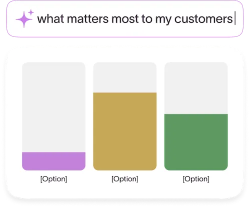
We've all received those emails before—the ones asking us to fill out a "quick" survey explaining our experience with a brand. Did we like what we bought? How likely are we to recommend their brand to friends and family?
Turns out, brands do this for a reason: because our answers give them crucial insights to help them do everything from building better customer experiences and personalizing marketing to designing better products.
But here's the thing—survey responses only matter if you actually use them to understand your customers and guide your decisions.
We know, "survey data analysis" sounds intimidating. But it can be relatively simple, especially if you've got AI tools that quickly analyze survey responses, identify trends and patterns, and reveal customer sentiment.
We're breaking down everything you need to know about turning responses into action.
The art of survey research
Survey data analysis is more of an art than a science. You'll get unique findings from it, but you'll have to interpret those findings to pull out valuable insights. Or figure out how to apply unexpected insights or results that conflict with each other.
Let's say you're trying to figure out if your customers prefer white, black, red, or green sneakers. You make a survey and the responses start coming in. Chances are, you won't get 100% of survey-takers wanting the same color.
Instead, you might get 55% voting for black, 25% for green, 15% for white, and 5% for red. That data can inform your next sneaker launch or colorway.
And that is the value of surveys: getting the data you need to make data-informed decisions that drive your business forward.
Here are just a few of the many surveys—including AI-powered ones—you can use to gather data.
NPS surveys

Net promoter score (NPS) surveys reveal how likely your customers are to recommend your products and services, giving you an idea of how happy they are with your brand, products, and services.
Customer support review surveys
Intentionally designing an unforgettable customer experience (CX) means making every interaction throughout the customer journey as pleasant as possible. Customer feedback helps you do that.
Customer service satisfaction surveys reveal what customers think about their experience with your customer service support team—helping fuel a better CX in the long run.
Customer success story surveys

Want to learn more about how your customers are using your products or services? Or the incredible results they're getting? A customer success survey gives them a voice while helping you understand where to double down and where you need to improve.
They also provide customer anecdotes that make for inspiring customer stories to bring in even more customers.
Concept testing surveys
Before you roll out new features or launch a new product entirely, consult with your customers. Do they want the new functionalities? Do your innovations align with their needs? Concept testing surveys check your assumptions and prevent you from wasting time building something your customers don’t actually want.
Churn surveys
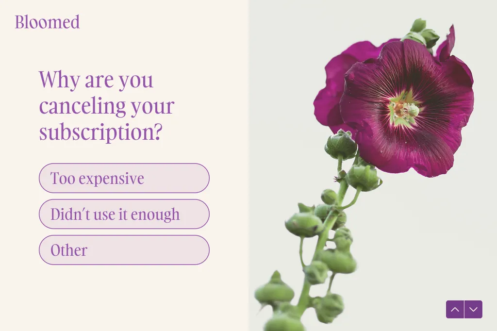
No one wants to lose customers. But when you don’t know why, you can’t make informed decisions that would help keep other customers from churning. That’s why we always ask our customers why they decided to stop using Typeform.
A simple churn survey lets us be proactive, address issues, and limit churn.
While surveys are a great tool for guiding business decisions, they can do far more than inform product roadmaps or prevent churn. Well-designed and thought-out surveys can engage employees and help you make sure everyone’s happy.
Here are a few examples we use at Typeform to help us keep employees satisfied.
Employee event feedback surveys
When we host internal events or company-wide off-sites, we want to make sure it’s an engaging, relevant, and worthwhile event for our employees.
We use employee event feedback surveys to learn more about our employees’ experiences at the event, what they enjoyed, what they didn’t, and how we can make future events more productive and enjoyable.
Employee engagement surveys

Your employees are your biggest asset—keep them engaged and happy at work by checking in with regular employee engagement surveys. Keep a pulse on employee well-being and make adjustments to make your company a great place to work for your employees.
The 5 stages of survey analysis
Surveys are a powerful tool for gathering the customer feedback you need for sustainable business growth. But without analysis, survey results don’t mean much. Analyze survey responses to identify trends, uncover sentiment, and make data-informed decisions.
Here’s a step-by-step guide to setting yourself up for success—from the start.
1. Take a step back
It’s easy to get caught up in gathering as much feedback as quickly as possible. But before you create your survey, take a minute to think about the goal, what you want (and need) to ask, and what you’ll do with the data.
Build your survey around the overarching goal and consider how you’ll present your findings. If you want hard numbers, using multiple-choice or yes/no question types might be a better option than open-ended questions.
Ask yourself:
- What’s the goal of the survey?
- Do I need stakeholder involvement?
- How will I present my findings?
- What questions should I be asking to get the information I need?
2. Clean your data
You’ve published your survey, the responses are rolling in, and you’re ready to analyze the results. But can you trust the data? Before you dive into analysis, you’ll want to cleanse the data to ensure it’s accurate and representative of your customers.
Look out for:
- Flat-liners. People who have gone through the survey and selected either the lowest or the highest end of the scale for every answer.
- Speeders. People who sped through survey questions too fast to give any quality answers.
- Anomalies. Responses that lie wildly outside the normal range, suggesting that they’re errors or typos.
What do you want to do with these data points? Include them knowing they’ll skew the results, or exclude them knowing you’re introducing survey bias by discounting certain responses? Remember, survey analysis is an art, not an exact science.
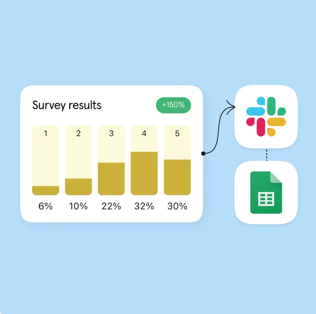
3. Analyze and visualize the data
.webp)
Now that you've cleaned your data, you can analyze the numbers to uncover hidden insights. But instead of just looking at lists of numbers, you can create data visualizations that make understanding the data effortless.
Here are some of the simplest ways to visualize survey data.
Pie charts
Create a simple pie chart to clearly illustrate the breakdown of responses by categories. Take the sneakers example from earlier. A pie chart could visualize that most people want black sneakers.
Pro tip: Use pie charts when you have fewer than six categories.

Bar charts
Want to show data that’s not a percentage of a whole (like company size) or visualize more than just a few categories? Try bar charts.
Let’s say you want to Let’s say you want to see where employees want to go for your next off-site. A bar graph could highlight the top locations employees suggested.

Word clouds
If you’re analyzing open-text questions, you might want to draw attention to specific words or phrases with word clouds—they display the most used words in responses, with the most frequently used words appearing the biggest.
Word clouds are a convenient way to show what terms keep popping up in open-text responses, guiding your focus.

4. Tell a story
Data should tell a story. While charts and graphs are an easy-to-understand way to share data, you'll want more than just visuals to present your findings. Organize results to tell a cohesive narrative and reflect the original question you were trying to answer.
Say you want to understand what features your customers want. The data shows that there are some new highly desirable features, but that what customers really want is for you to enhance existing features.
Only showing the new desired product functionalities leaves out the most important part of the story. Use data to tell a complete story.
5. Follow up and get clarity
One survey might be enough to answer the questions you set out to answer in the first place. But if it brought up more questions or you want to get a better understanding of what survey-takers meant by something, don’t hesitate to follow up.
It’s totally fine to go back and do another survey—but consider a different format that might give you more clarity. Want to go more in-depth with your customers? Conduct a few qualitative interviews to go into more detail.
Want to get more marketing insights from the Typeform team? Subscribe to Informed, our monthly newsletter where we share industry trends, related opinions, and more tips and tricks.
What tools do you need for survey analysis?
Once you’ve run your Typeform survey, you’re going to (hopefully) have a ton of responses to go through. Here are a few of the tools we use at Typeform to analyze survey data, identify patterns, and inform our decision-making.
1. A spreadsheet
Survey data analysis doesn’t have to involve complex tech stacks or complicated tools—a good ole Google Sheet is more than enough to analyze your data. Send your Typeform responses to Google Sheets or Excel (automatically with our integrations) to manage data in one place and transform it into charts and graphs.
Using one of our spreadsheet integrations, your spreadsheet will automatically sync as new responses come in. And with conditional formatting and formulas, you can take raw data and visualize it into digestible insights.
2. A business intelligence (BI) tool
Want to take survey data analysis to the next level? Consider adding a BI platform to:
- Create automated dashboards that let you track trends over time
- Make more sophisticated data visualizations
- Connect data from multiple sources to get the whole picture
While you won’t need this level of detail for most surveys, BI tools work well if you want to really get into the weeds with the numbers.
3. A qualitative analytics tool
Tools like Google Lookers help you crunch the numbers, but if you’re mostly gathering open-text responses, you’ll need a qualitative analytics tool to help you spot trends in open-ended responses automatically (like how Typeform AI can quickly identify sentiment).
Typeform integrates with a few of these tools, including MonkeyLearn and Chattermill. Or you can use Zapier to automatically move Typeform responses to your BI platform.
Data analysis for non-analysts
You don’t have to be a data analyst or genius to draw meaningful insights from your survey data. Surveys won’t necessarily give you the definitive answers to your business questions, but they can give you the data you need to make an informed decision.
Want to learn more about analyzing survey data? Use our data analysis tips.


